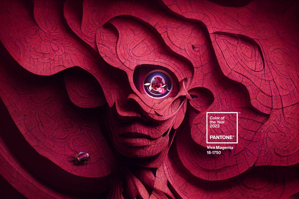
You may have heard this year’s Pantone colour of the year is Viva Magenta, a bright and vibrant hue that is sure to add a pop of colour to any room. Using bright colours in home decor requires a little finesse. You don’t want too much going on but you want to utilize this trending shade to elevate your home decor style. Read on to find out which of our fabrics match best with this year’s trendiest colour! Plus, get our best tips for using bright and bold colours the right way.
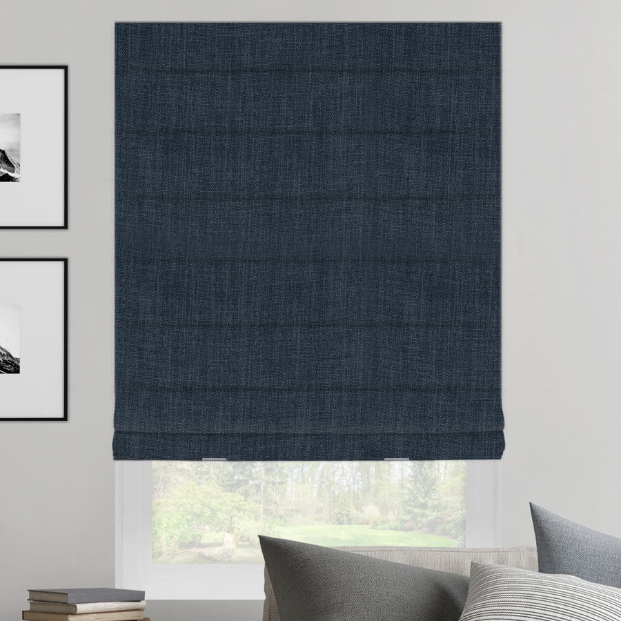
Make Viva Magenta Pop with Navy Blue
though also a deep colour, navy is a rich tone that is very understated. Classic in nature, navy can balance the bright hue very well. The colours complement one another perfectly and the traditional navy colour prevents the magenta from becoming too overpowering but still makes it pop just enough. We also love how this fabric texture looks and feels. It has a soft and slightly linen-like feel to help create a softer finish.
Pair Viva Magenta with a Delicate Pattern
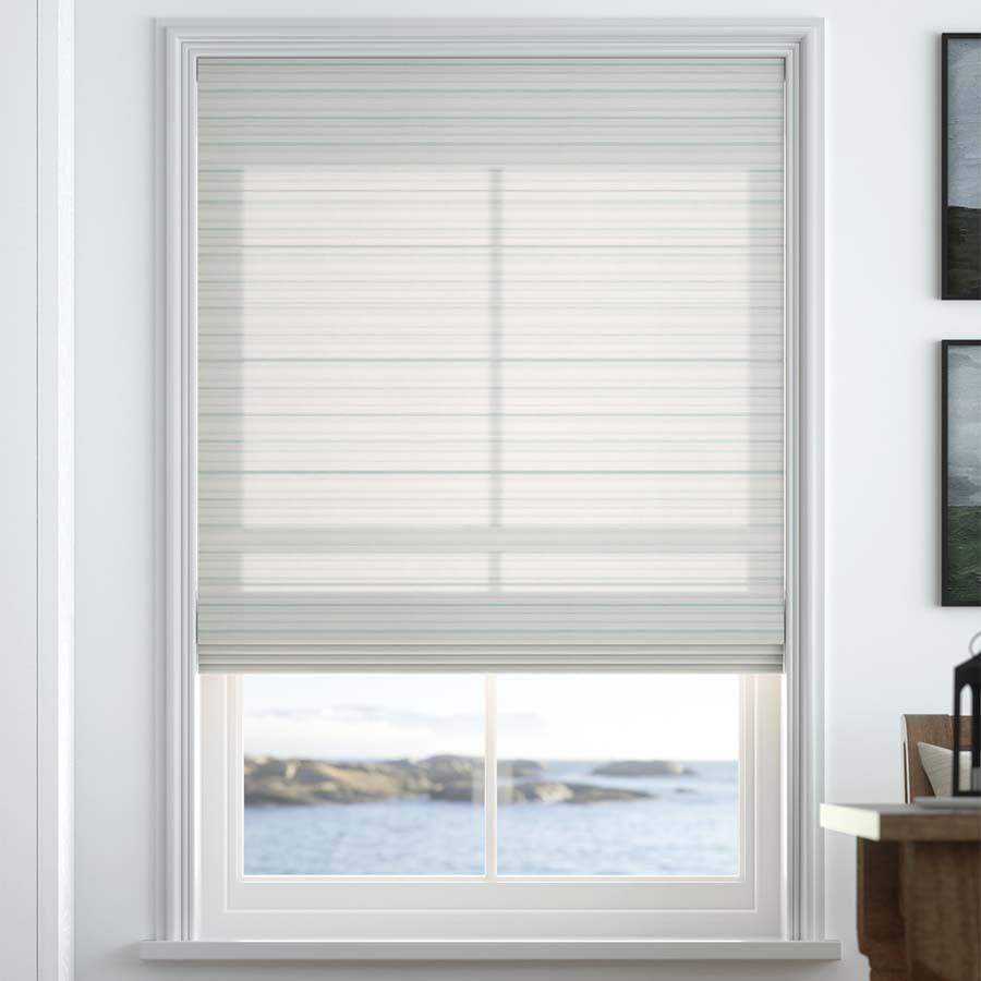
You can still choose a patterned window covering, even if your room has a lot of colours going on. If you are planning on adding some magenta accents to your space, we highly recommend this understated print called Lakeshore Stripes. The pale, mint green and sage tones are a low-key match that balances out the bright magenta tone.
They complement each other well and you can count on this pattern to withstand any trend. So if magenta accents become a thing of the past any time soon, you won’t need to change your window coverings, too. This light pattern is a guaranteed classic.
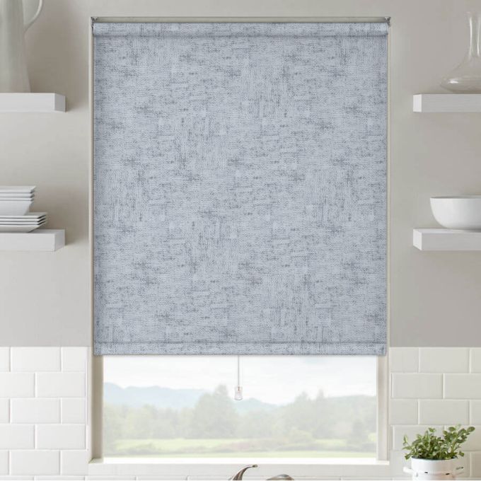
Blue-Toned Grey is a Perfect Match
Grey with a bluish hue is a great match for magenta, which also has a cool undertone to it. You can count on grey to blend in seamlessly with nearly anything in your home decor setting. If you plan to experiment with this bold magenta hue, then opt for a balancing shade like Cool Grey. It maintains the style you’re trying to achieve without distracting the eye from your Viva Magenta accents.
How to Use Bold Colours in Your Home
There are a few tips to keep in mind when it comes to using bright colours like Viva Magenta in your home decor plans. Bold colours can stand out much more than you think so you want to make sure you get it just right. Here are our best tips for incorporating bold and trendy shades into your home decor plans:
- Less is More: This is an important one to remember. If you use too much bold colour, it can make the room look too busy. It also doesn’t have the same effect if colour is everywhere as opposed to when it’s used sparingly.
- Focus on inexpensive accents: Consider applying magenta to your most inexpensive accents like wall art, throws, or pillows. These are items that are easy to replace when the trend passes or you simply don’t like them anymore.
- Choose ONE bold colour: If Viva Magenta is your focus, stick to it. You can’t add in tons of bold colours at once because they’ll clash and make the room too much to handle. Instead, remember to keep it simple with one main colour.
- Choose a focal point: Before you decide where you want to use your bright hue, decide on the focal point of the room. That’s where you should start adding in your bold colour tastefully.
- Balance everything with neutrals: Neutral tones are the perfect accessories for bold colours. If you choose a traditional, neutral, understated complement, your bold colour will pop just right. No matter what the trend is, neutrals are always on point.
What are your best tips for experimenting with colour in home decor? Let us know in the comments below. Are you thinking about trying Viva Magenta in 2023?