Each December, the global design community turns its attention to one highly anticipated announcement: the PANTONE® Colour of the Year. This influential selection helps shape trends across interiors, fashion, and product design for the year ahead.
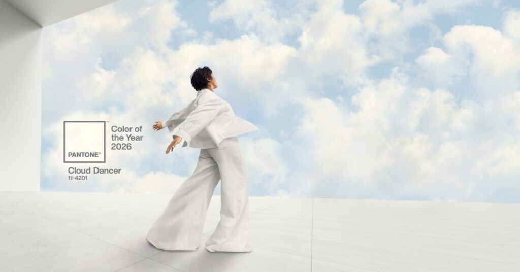
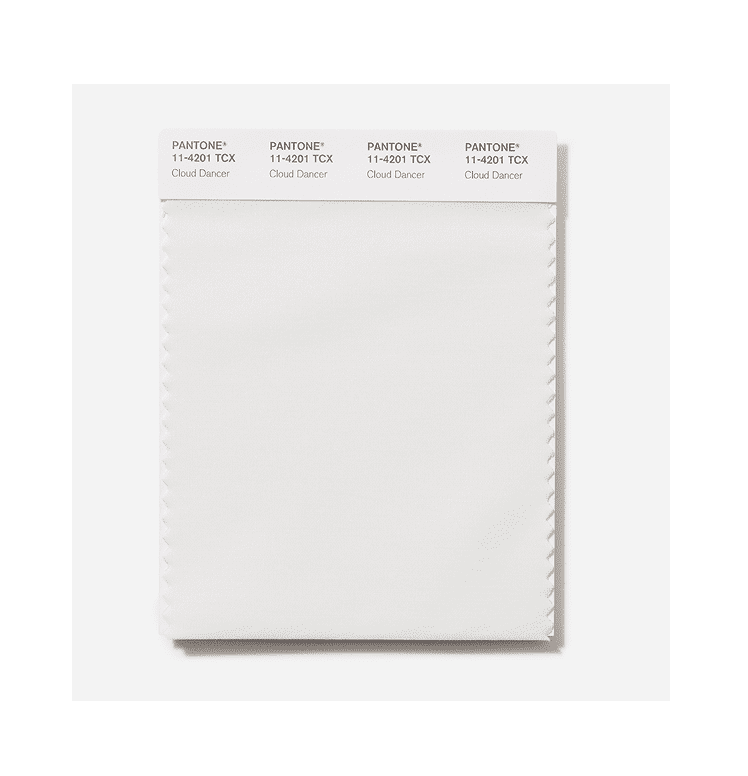
In December 2024, PANTONE® revealed Mocha Mousse as the 2025 Colour of the Year. Then, on December 4, 2025, the PANTONE® Colour Institute unveiled its 2026 choice: PANTONE® 11-4201 Cloud Dancer—a soft, luminous white that reflects a renewed desire for clarity, calm, and creative possibility.
How the PANTONE® Colour of the Year Is Chosen
Since its founding in 1962, Pantone® has become synonymous with colour authority and design innovation. The PANTONE® Colour Institute is internationally recognized for forecasting colour trends that influence industries worldwide—including interior design here in Canada.
Each year, Pantone’s experts conduct extensive global research, analyzing cultural movements, social behaviour, design innovation, and consumer sentiment. The Colour of the Year is not chosen lightly; it represents the collective mood of the moment and offers insight into where design is heading next.
For designers, homeowners, and creatives alike, the annual reveal serves as a guidepost for emerging palettes and evolving aesthetic preferences.
Colour of the Year 2026: PANTONE® 11-4201 Cloud Dancer
According to the PANTONE® Colour Institute, Cloud Dancer is an airy, serene white with a soft, billowing quality. It brings a sense of lightness and quiet confidence—perfectly aligned with a time when many are craving balance, reflection, and room to breathe.
While recent Colour of the Year selections have focused on warmth and comfort, Cloud Dancer shifts the focus slightly. It still offers calm and reassurance, but with a renewed emphasis on openness, imagination, and thoughtful creativity.
Mocha Mousse, the 2025 Colour of the Year, delivered richness and indulgence. In contrast, Cloud Dancer feels expansive and uncluttered, offering a visually clean foundation that allows other colours, textures, and ideas to shine.
Leatrice Eiseman, Executive Director of the PANTONE® Colour Institute, describes Cloud Dancer as “a discreet white hue offering a promise of clarity” during a period of global transition.
Laurie Pressman, Vice President of the PANTONE® Colour Institute, adds that Cloud Dancer reflects our search for equilibrium—bridging our increasingly digital lives with our deeply human need for connection, creativity, and authenticity.
At its core, Cloud Dancer acts as a blank canvas. It adapts effortlessly, complements a wide range of colours, and brings a feeling of soft light and calm to any interior.
Decorating With Cloud Dancer at Home
PANTONE® 11-4201 Cloud Dancer is intentionally understated, making it ideal for home décor. Its simplified tone encourages rest, focus, and a sense of ease—qualities that resonate strongly in Canadian homes designed for comfort across all seasons.
Because Cloud Dancer is so versatile, it works beautifully as both a main colour and a supporting shade. Whether you want to refresh a single room or subtly update your entire home, it offers endless flexibility.
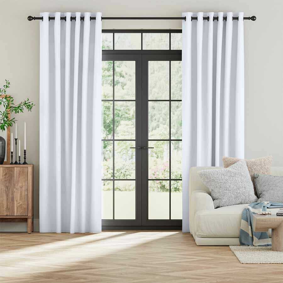
Window Coverings: An Easy Way to Introduce Cloud Dancer
Blinds and curtains are one of the most effective ways to bring Cloud Dancer into your space without committing to a full redesign.
- Ivory Roman Blind
This blind introduces a clean, contemporary feel with its off-white bamboo fibres and finely woven linen texture. Its natural materials echo the softness and calm of Cloud Dancer while adding visual interest and warmth—ideal for Canadian interiors that favour layered textures. - Cloud Canvas Delicate Drapes
Elegant and understated, these off-white curtains capture the refined simplicity of Cloud Dancer with an added touch of luxury. Floor-to-ceiling curtains are especially effective for creating a sense of openness and light, even during darker winter months. - Oatmeal Double Zebra Blind
This option offers both style and function. The softly textured oatmeal fabric provides warmth and serenity, while the coconut voile layer maintains brightness and airiness—perfectly reflecting the key characteristics of PANTONE® 11-4201.
Colour Palettes That Pair Beautifully With Cloud Dancer
While Cloud Dancer works effortlessly with nearly any colour, choosing the right supporting palette can elevate your space even further. Pantone® has introduced seven curated colour palettes for 2026; below are three standout options for home décor inspiration.
Powdered Pastels
Soft pastels and gentle neutrals pair seamlessly with Cloud Dancer, creating calm, welcoming interiors. Pantone® describes this palette as featuring subtle, nuanced shifts in colour that feel refined and soothing.
Paint walls in Cloud Dancer and layer in pastel accents for a light, refreshing atmosphere—ideal for bedrooms, nurseries, or reading spaces.
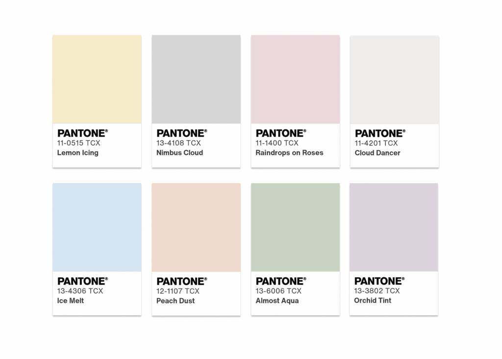
Comfort Zone
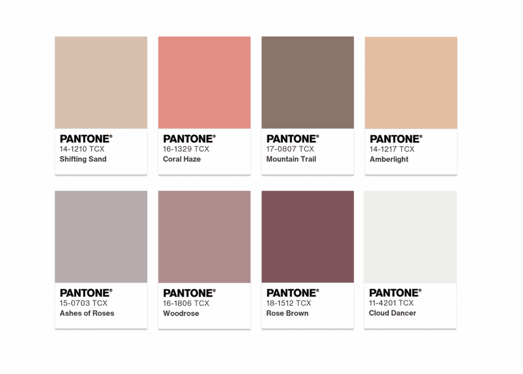
Designed to foster rest and relaxation, this palette draws from organic, nature-inspired tones. Pantone® describes these colours as embracing and grounding—perfect for creating a cozy retreat during colder Canadian months.
Glamour & Gleam
For those who love bold, statement-making interiors, this palette highlights Cloud Dancer’s strength as a neutral base. Pantone® describes it as a striking contrast of white and black, accented with rich, dramatic reds.
- The William Morris Strawberry Thief Jacquard Linen Roman Blind from the V&A collection introduces jewel tones and intricate pattern, creating instant impact.
- Balance the look with Sheer Winter Delicate Drapes, which echo the softness of Cloud Dancer and keep the overall space feeling light and polished.
Bringing the PANTONE® Colour of the Year 2026 Into Your Space
PANTONE® 11-4201 Cloud Dancer is a beautifully adaptable shade that works across design styles—from modern and minimalist to classic and layered. Its calming presence, combined with its ability to highlight other colours and textures, makes it a standout choice for Canadian homes in 2026.
If you’re looking for more inspiration, explore our collection of white blinds and curtains, and take advantage of our free sample service to find the perfect match for your space. Enjoy experimenting with PANTONE®’s Colour of the Year and creating a home that feels both current and timeless.